Chris Allen
Officer Web Portal
Project Overview
The project involves designing a desktop version of the RollKall mobile app. The goal of this project is to include all mobile app features in the officer web portal. The design should meet usability standards, maintain brand consistency, and optimize page layouts for easy access to schedules and job details.
Responsibilities:
-
UX Research (interviews, personas, competitor analysis)
-
UX Design (user flow and usability testing)
-
UI Design (high fidelity mockups)
Role: Lead Designer
Length of project: 10 months
Company: RollKall
DISCOVERY
Project Brief
RollKall was negotiating with Honolulu PD, who were using one of our competitors for off-duty job scheduling. Their contract was about to expire, and we didn't yet support desktop functionality. However, they were willing to switch to RollKall after their contract ended if we developed a desktop version of our mobile app.
Research
I began my research by interviewing Honolulu PD and other law enforcement agencies that had requested a desktop portal in the past. From these user interviews, persona identification, and a competitor analysis, I gained valuable insights into the following research objectives.
-
Why do LEAs initially choose our competitor over us?
-
Why do officers want a desktop portal?
-
What problem does a desktop portal solve that the mobile app can't?


Key Findings
-
Competitive Advantage: Our biggest competitor (CYA) has less features than the RollKall platform but has a desktop version which officers strongly value.
-
Inflexibility: Many officers are aged between 40-55 and prefer to use desktop over mobile because that's what they're use to and don't want to change.
-
Problem vs Nice to a have: A desktop portal doesn't solve any issues that our mobile app can't, but officers prefer it. They find value in seeing more content on a larger screen rather than on a mobile phone.
Problem vs Nice to have
Research findings indicated that while there were no critical issues requiring immediate attention for LEAs, a decision needed to be made by RollKall leadership. The question was whether to allocate resources toward addressing a feature that, while beneficial, is more of a "nice to have" rather than a pressing necessity.
The Decision
RollKall's senior leadership decided to invest in enhancing our product, focusing on closing feature gaps that could potentially drive clients to competitors. This strategic investment aims to strengthen our position in the off-duty job scheduling market by offering a more comprehensive solution, ultimately reducing the risk of client attrition and maintaining our competitive edge.
IDEATION
Vision Board and Flow Chart
Since officers requested to see more content per page, I focused on brainstorming ideas to make better use of space and enhance the UI. I created a vision board and collected mock-ups of content-heavy platforms to help establish my design structure.


PROTOTYPE
Low-fidelity wireframes
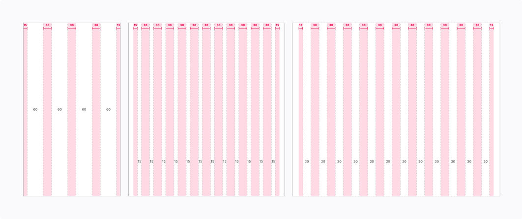
I started the prototype phase by creating low-fidelity wireframes to establish page layouts for mobile, tablet, and desktop. I worked closely with engineers to ensure there wouldn't be any issues with responsive page layouts in the future.

Mid-fidelity mockups

As I progressed to mid-fidelity mockups, I used components from my design library and the mobile app as my guide. This ensured design and brand consistency and made sure that all features from the mobile app were included.


High-fidelity mockups
To differentiate the interface of the mobile app and the officer web portal, I focused on the small details that would enhance the UI.
Color scheme: I used a darker blue as the primary color and a more vibrant blue as a secondary color.
Font size: I increased the font size from 14px to 16px to make content easier to read.
Contrast: To increase contrast for the important content, I made the front-facing content brighter and the background colors darker.
Racing stripe: Below the primary header, I included a vibrant blue bar. I like it because it reminds me of a racing stripe on a sports car.


TESTING & ITERATING
Testing the prototype
I conducted usability tests with officers to ensure the core features met their needs. All six officers were able to complete every task without assistance and were very happy with the design. While I was pleased with this feedback, I collaborated with the engineering team to iterate areas that could use improvements.
Major Iterations
-
Location copy: Include the ability to copy the job location from the job card.
-
Increased job card width: Expanded job card's width to increase the readability of the job card's content.
-
Hover color: Increase the visibility of the hover color in dark mode.
-
Settings Page: Condense the settings features onto one page.
-
Side panel: Restructure and relocate side panel.
-
Calendar View: Redesign the monthly calendar view to prevent performance issue.


Final Design
The final design of the RollKall Officer web portal incorporates all the features of the RollKall mobile app. The new UI uses vibrant colors and enhanced color contrast to improve content visibility and highlight important items. Officers benefit from a larger page layout, allowing them to view and interact with more content during browsing sessions.


Project Conclusion
After completing all my design iterations, I scheduled a demo session with the Honolulu Police Department and RollKall's senior leadership. During the session, I walked them through the portal and gathered their feedback. Both Honolulu PD and RollKall senior leadership were very pleased with the project. The officer web portal was successfully developed and deployed and is being used daily by Honolulu police department.
What I learned