Chris Allen


Streamlining Safety:
A UX Approach to Paperwork Management"
Project Brief
James Hardie operates in the building materials industry. Manufacturing plants can be dangerous due to hazards from the environment, machinery, and materials. Employees at James Hardie must regularly fill out safety documents to ensure that safety protocols and regulations are followed.
Project Goal
The goal of this project was to create a platform that makes the submission of urgent safety documents faster and more efficient.
Company: James Hardie
Length of project: 12 months
Responsibilities
-
UX Research (interviews and personas)
-
UX Design (user flow and usability testing)
-
UI Design (high-fidelity mockups)
Tools used
-
Figma
-
Miro
-
Octopus
-
Pintrest
Empathy Phase
Feeling the Pressure
Imagine working in a fast-paced environment where you're exposed to extreme temperatures for over 12 hours. Heavy machinery surrounds you, and motorized vehicles zip past from every direction. The company expects you to meet demanding daily production quotas—all while prioritizing safety.

Every week, you're required to complete safety documents, with additional paperwork needed whenever you operate machinery, use specialty tools, or handle chemicals.

Observing these challenges firsthand, I recognized a critical need within the company to improve its ideology about safety and how safety paperwork is completed and managed.
Define Phase
Identifying the Challenges
I was able to pin point the primary challenges in James Hardie’s documentation compliance cycle by gathering feedback from interviewing all staff members involved in the process.
Persona 1: Managers

Persona 2: Supervisors

Persona 3: Hourly Staff

I identified three key personas—managers, supervisors, and hourly staff—each with unique pain points. Hourly staff struggle to complete paperwork due to production pressures and supplies not being readily available, supervisors are frustrated with constantly having to remind staff to complete their documents, and managers worry about failing annual safety audits.


Problem Statement
Hourly staff face intense pressure to meet daily production demands, often leaving safety documentation incomplete or rushed. I have witnessed hourly staff use heavy machinery without completing the required paperwork before operating the equipment to prevent falling behind with a production line. This creates additional strain on supervisors, who must constantly enforce safety compliance to avoid potential safety audit failures. Without a more efficient and user-friendly documentation process, the company risks safety non-compliance fines and increased pressure and workload for all staff. A more intuitive and streamlined solution is needed to ensure safety protocols are followed without disrupting productivity.
Ideate Phase
Determining Project Scope, Features & Architecture
While determining the project's scope, I did run into some hurdles after several discussions with management. The challenges outlined by management helped define my project scope. Since mobile functionality wasn't practical, I focused on optimizing the design specifically for tablet use.
Scope Hurdles

Solutions
I formed my project scope by carefully selecting features based on their ability to address key user pain points, then prioritized them by immediate impact—ensuring the most critical functionalities were implemented first, while others were scheduled for future iterations.
Platform Features

Feature Prioritization Matrix

With a clear understanding of the project scope and feature set, I was able to easily map out the platform's architecture.
Information Architechture Diagram

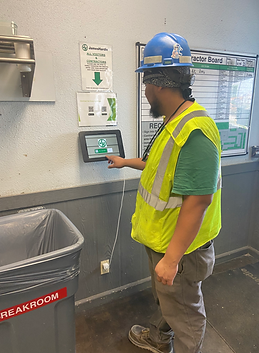
I worked with the safety team to identify safe locations within the plant for placing the tablet stations.
Safety Workstation

Prototype, Test and Iteration Phase
Crafting the platforms behavior and UI
I initiated the visual and interaction design of the platform by purchasing a professional design kit from the Figma Community. Collaborating closely with engineering, we defined the grid system, typography, color palette, and UI components—ensuring consistency and scalability across the platform.


Low /mid-fidelity wireframes
During the low to mid-fidelity design phase, I prioritized intuitive content structure and streamlined user flows, ensuring each step required minimal effort to complete.


Usability testing
To validate the effectiveness of my user flows, I built clickable prototypes and assigned task-based scenarios to testers. I observed their interactions, noted any usability challenges, and gathered direct feedback. This testing phase was instrumental in refining and iterating my designs as they progressed toward high-fidelity


Areas to Improve
-
Decrease clicks (Some users felt like the documentation completion process was still long.)
-
Information chunk (The long vertical scrolling made users feel that the process was long.)
-
Progress feedback (Because there was an infinite scroll, users didn't easily know how long a document was.)
-
Iterate dropdown title (Some users didn't understand all dropdown titles.)
-
Highlight Text to Speech feature (Some users type slowly, which makes writing by hand faster.)
-
Auto Fill Capability (Users' time could be shortened if they didn't have to fill personal information.)
-
Navigation issues (Users weren't able to go back on some screens.)
-
Toast messages (Users didn't have confirmation messages when certain tasks were completed.)
-
Error Feedback (Users didn't have any feedback when an error was made.)
-
Required asterisks (Users tried to skip through steps but couldn't.)
Iterations

Drop-downs require 2 clicks, while the slider requires one slide. This change will reduce user interaction time.
To support users who may type more slowly, I enhanced discoverability of the speech-to-text feature by embedding a microphone icon directly within the text input field.

Users felt overwhelmed by a long list of fill-in-the-blank questions; I implemented a carousel pattern with clear progression indicators. This approach broke the content into manageable steps and made the experience feel more approachable and less time-consuming.

I conducted weekly usability tests alongside the design process to validate new screens and user flows. Through several rounds of iteration based on user feedback and engineering collaboration, I refined the experience and brought the designs to high fidelity.
Project Conclusion
To support quick and efficient document completion, kiosk stations were posted in safe zones throughout the plant allowing staff to access and fill out safety documents from any station in the facility.

For Hourly Staff:
Features like text-to-speech, minimal click paths, and automated data population reduce friction and help users complete forms faster with less cognitive load.


For Managers and Supervisors:
I designed a streamlined interface that gives managers and supervisors quick access to historical data, including completed documents and assessments. Features like advanced filtering, emailing, status reminders, and PDF downloads make it easy to locate records, communicate with staff, and maintain accurate documentation—all while saving time and improving oversight.


Mesuring Success
To evaluate the impact of the new solution, I measured how quickly users with varying levels of tech proficiency could complete documents, tracked the number of late submissions compared to the previous process, and gathered qualitative feedback from supervisors about the burden of sending reminders. Post-implementation, on-time document completion rates increased significantly, hourly staff responded more consistently to reminders, and supervisors reported reduced frustration. Managers also noted how much easier it was to access historical data and communicate safety compliance issues—leading to faster resolution of potential risks.

.png)
.png)
.png)

What I learned